Nothing OS 4.0 : Nothing has rolled out its latest software update — Nothing OS 4.0, and while it may look nearly identical to Nothing OS 3, there are a few thoughtful changes tucked beneath the surface. Let’s dive in to see what’s new, what’s improved, and what still feels… missing.
First Impressions – Looks the Same, Feels a Bit Smoother
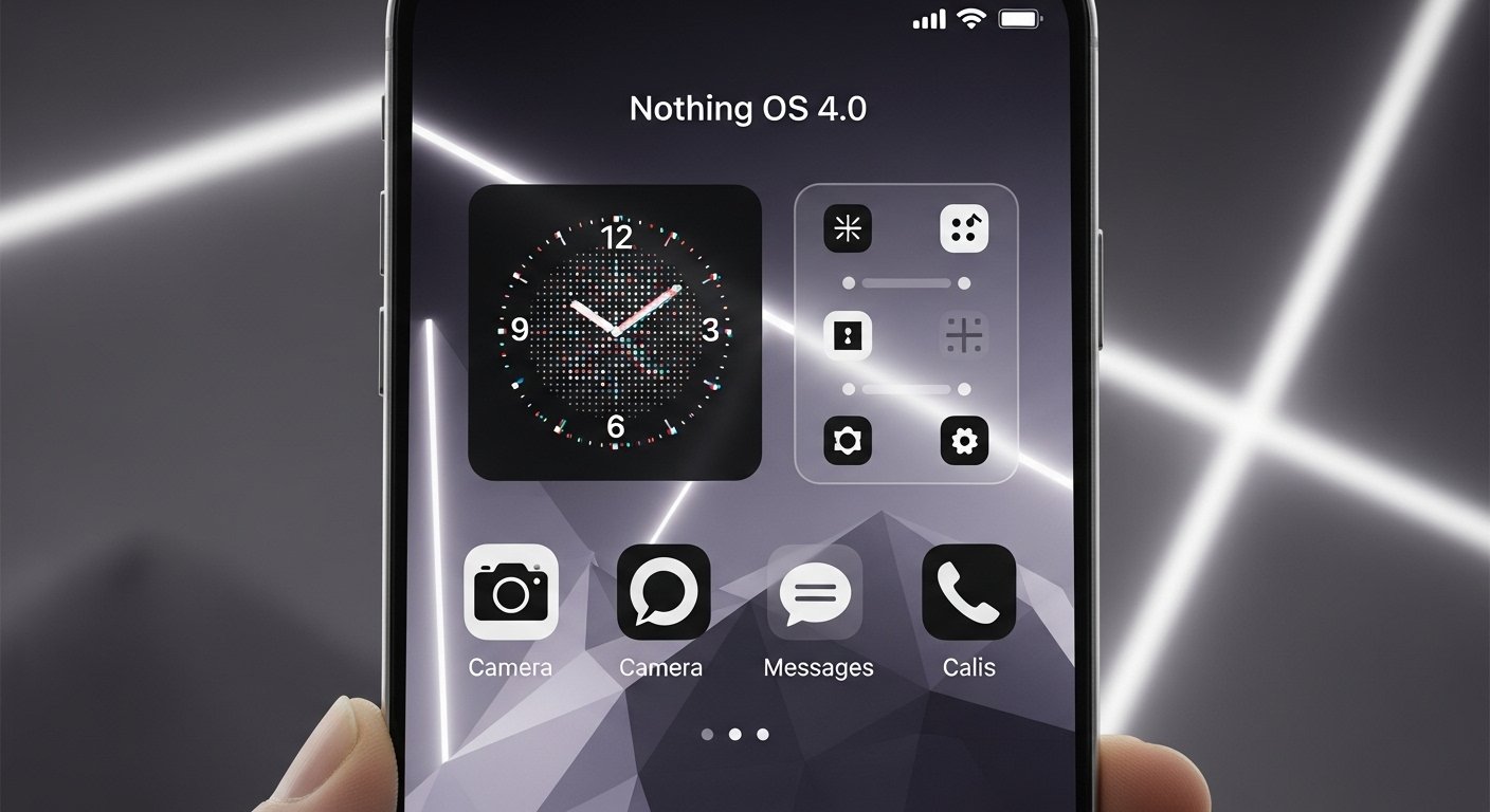
At first glance, you’d be forgiven for thinking Nothing OS 4.0 hasn’t changed at all. Visually, it’s almost identical to the previous version. Even my teammate couldn’t tell the difference until I showed him the “About” section.
But after using it for a few days, the differences become clearer — subtle, but meaningful. App opening and closing animations are smoother, transitions feel more fluid, and overall usage has a slightly more refined polish. It’s not a massive leap, but definitely a small step in the right direction.
Extra Dark Mode – True Black Is Finally Here
The old dark mode on Nothing OS always felt a bit grayish and hesitant. With Extra Dark Mode, the company finally nails the deep, AMOLED-friendly black users have been asking for.
Everything now turns pitch black, which not only looks better but also saves battery on OLED displays. It’s a simple tweak that makes a big visual impact.
Pop-Up View 2.0 – Multitasking Gets Smarter
The pop-up view feature has received a smart update. You can now keep two pop-up apps open simultaneously, switch between them effortlessly, or hide them with a simple swipe gesture.
For power users and multitaskers, this small update adds noticeable convenience.
Quick Settings – More Customization and Better Feedback
The quick settings panel also gets a handful of refinements:
- You can now convert any toggle into a 2×2 tile, not just Bluetooth.
- A small text notification appears each time you toggle a feature like Torch or Bluetooth.
- The Wi-Fi icon now includes a share button, making it faster to share your connection.
- Brightness adjustment feels smoother, and icons have been subtly redesigned.
Interestingly, Nothing seems to be reducing its use of red color accents throughout the interface — maybe for a cleaner, more neutral look.
Recorder App – Simpler but Less Fun
The built-in recorder app has been redesigned. The vinyl animation that once spun interactively has been replaced by a more minimalist layout. While it looks modern, some users may miss the old, DJ-style charm.
There’s also a new option that lights up the rear recording LED while recording — though it doesn’t seem fully functional yet.
Lock Screen and Always-On Display – Smoother Transitions, Fresh Clock Styles
Two new clock faces have been added to the lock screen — one inspired by the iPhone 17 Pro and another by the Apple Watch’s Air font.
Transitions between the lock screen and Always-On Display are now much smoother, eliminating the old flicker issue.
Essential Apps – A Creative Step Toward User-Made Mini-Apps
One of the most interesting additions is Essential Apps — a concept that lets users create and share mini-apps using simple text prompts.
Currently, these are limited to widgets, but the potential here is huge. People have already created tools like:
- Water intake reminders
- Dice rollers
- Mini games (Flappy Bird, 2048)
- Flight and step reminders
This “community-driven creativity” feels like something only Nothing could pull off, aligning with their vision of shareable and open design.
Settings App – Cleaner, but a Bit More Scroll
The About Page now displays a large image of your device, which looks good but also pushes important info lower down the screen.
There’s also a new App Optimization feature that promises faster app launches with a single tap — simple and effective.
AI Usage Page – Transparency, Not Control (Yet)
A new AI Usage Dashboard shows how often each AI model has been used. It’s a neat addition for transparency, and an AI indicator icon now appears in the status bar when AI features are active.
However, you can’t control anything from here yet — it’s more informative than functional.
Final Thoughts – Stable, Polished, but a Bit Too Safe
Nothing OS 4.0 feels like a stability update rather than a feature-packed release. Everything works smoothly, and the refinements are nice, but the lack of major innovations makes it feel like a missed opportunity — especially with competitors like OxygenOS 16 and OriginOS 6 bringing in bolder features.
Essential features such as better haptics, redesigned camera app, and advanced gallery tools are still missing. Hopefully, those will arrive in Nothing OS 5.0.
Verdict
✅ Pros
- Smoother animations
- True black dark mode
- Better multitasking
- Creative Essential Apps feature
❌ Cons
- Minimal visual change
- Missing promised features
- Recorder redesign feels unnecessary